Gelish Street Beat Collection Review – Cou-tour the streets, B-girl style, Hip hot coral, Tag your it, Street credible & Give me a break-dance swatches and comparisons

Hi all.

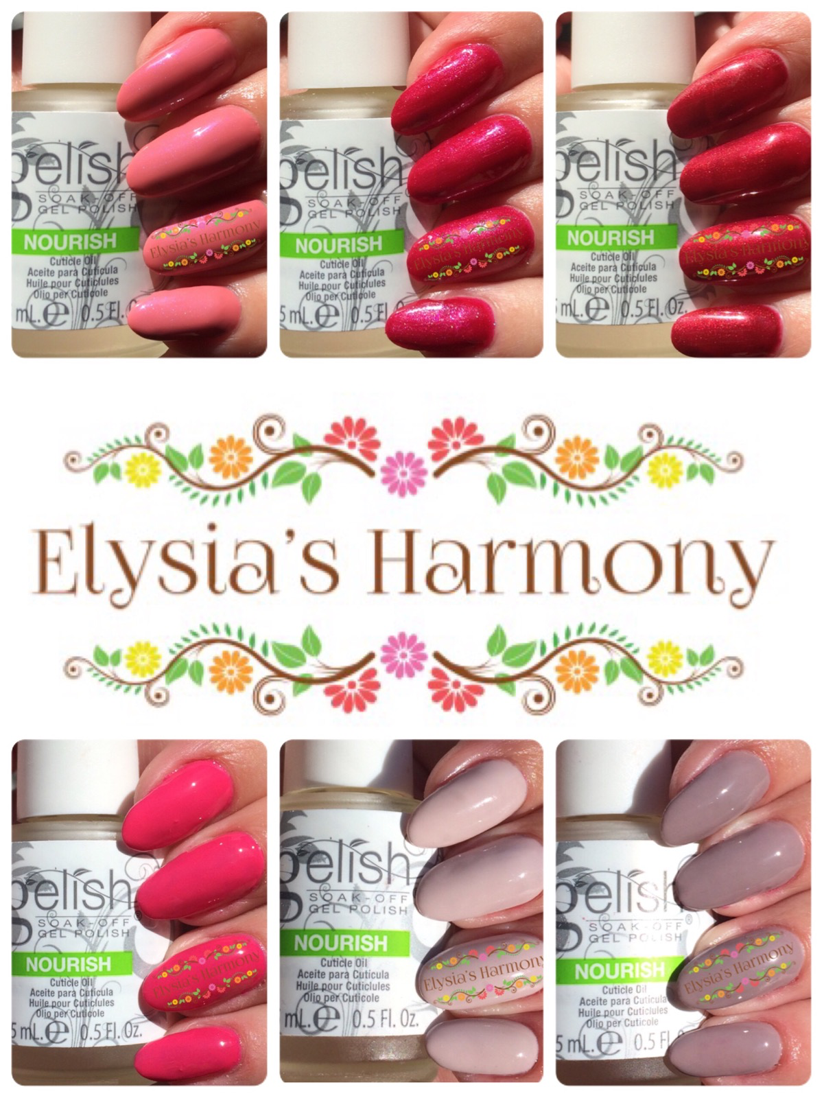
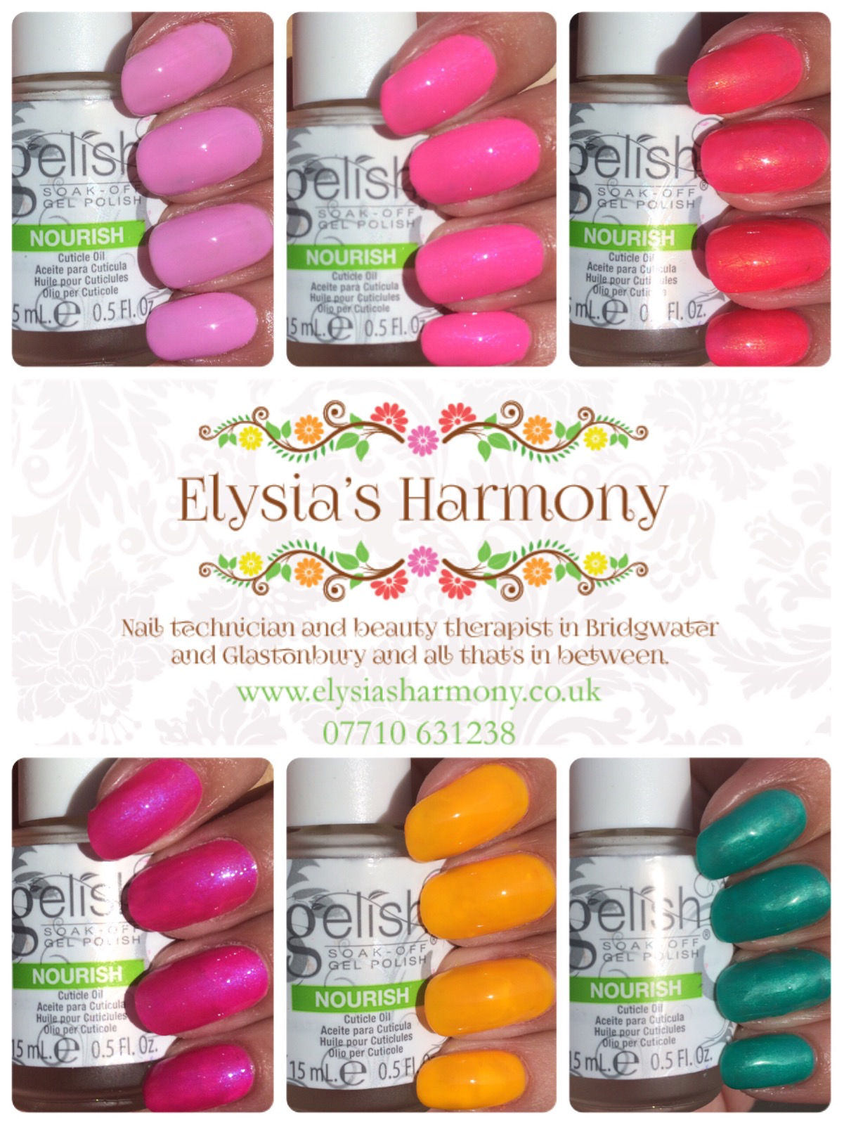
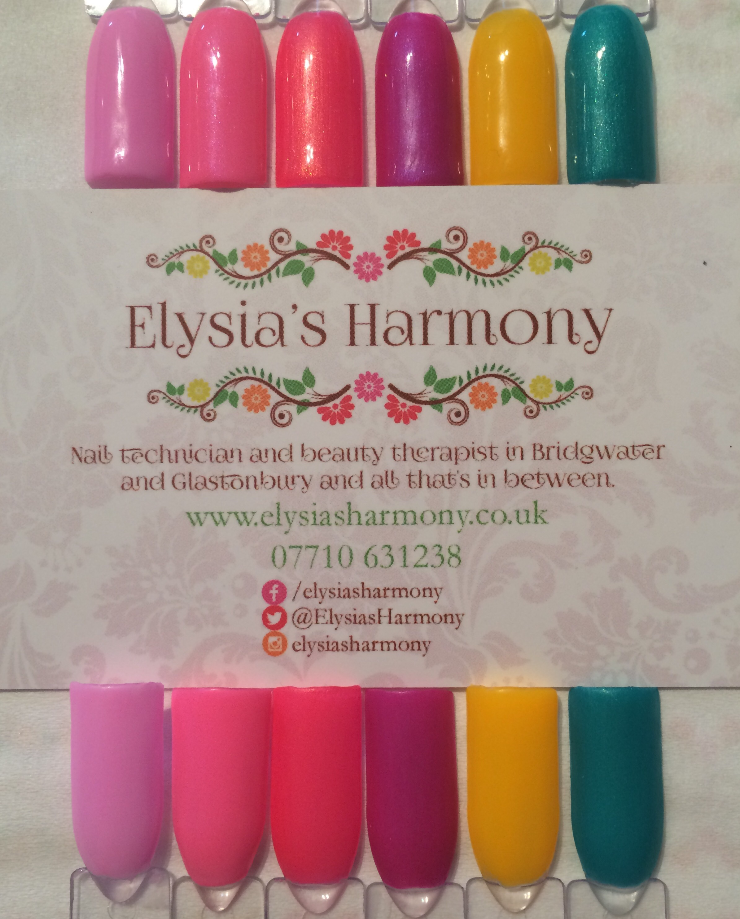
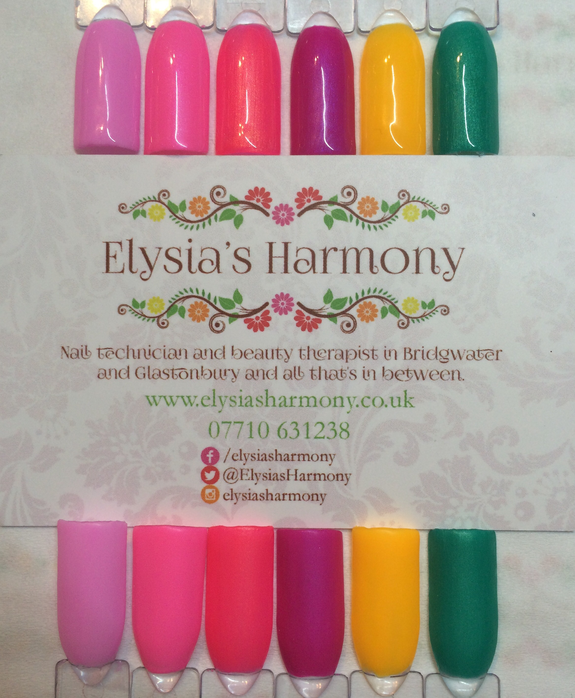
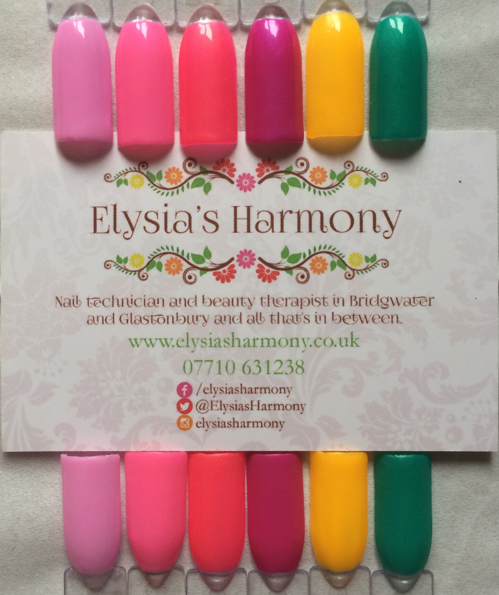
Here’s the newest summer collection from Gelish. First released in the UK at the Birmingham beauty show in May with main sale opening 27th May 2016 (Sally’s are meant to release them on the 28th of June).  This time the swatches are back on my natural nails and as per usual the lighting is indoor, led and outdoor. The collection comprises of 6 upbeat colours and comes with a very upbeat speaker to (which is fairly descent) and draws inspiration from street art. There are as per usual Morgan Taylor matching polishes.

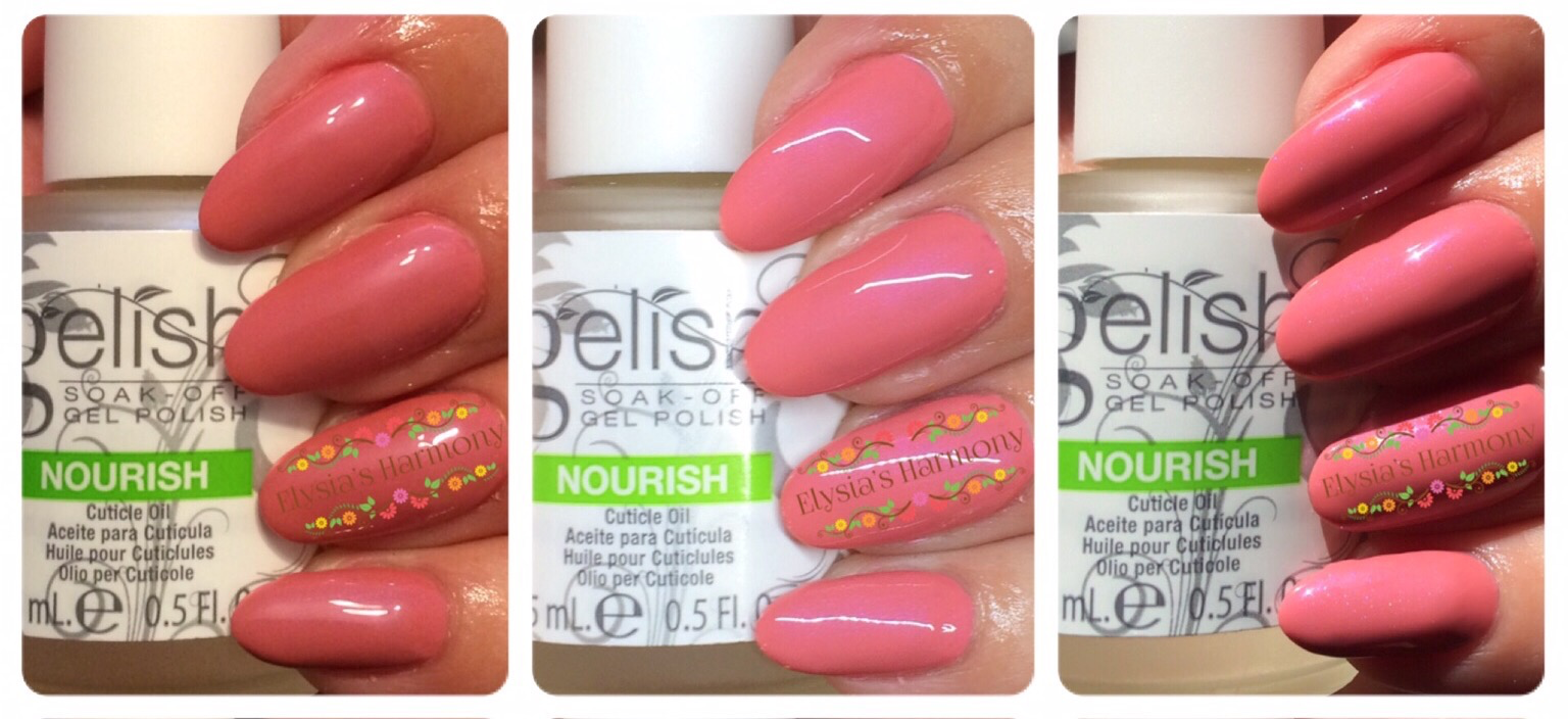
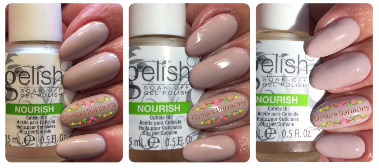
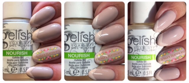
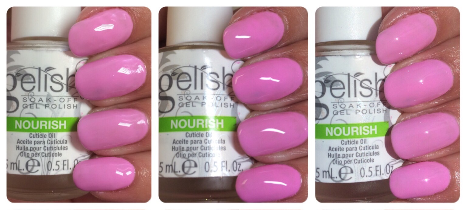
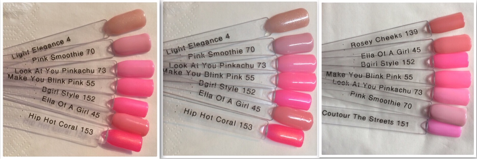
Cou-tour the streets – 3 coats

This colour has been advertised as a lilac cream and it does indeed have a lilac tone in it when I was grouping it with my swatches. To look at on its own I personally see a light bubblegum pink. I found the application a little watery with this one 🙁 so lots of warming and stirring is required for a nice application in 3 coats. I do not have similar colour to this and will be a nice addition to my collection.

Cou-tour the streets comparison pictures

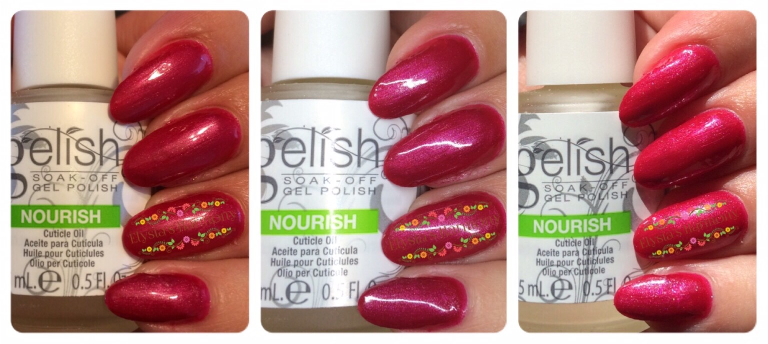
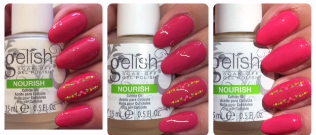
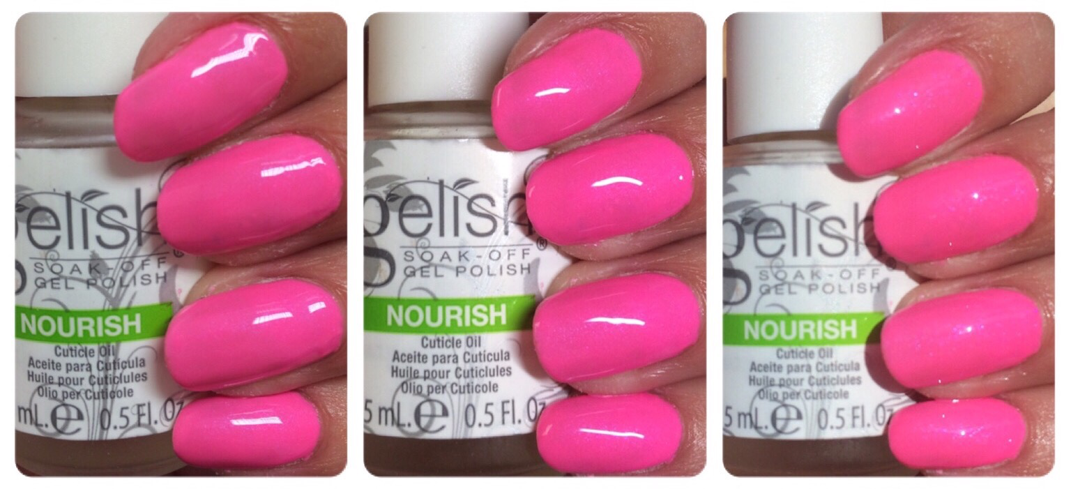
B-girl style –  2 coats

This is beautiful neon pink peal with a good application, I love it. This is most like make you blink pink but with a far superior coverage.

B-girl style lighting comparison pictures

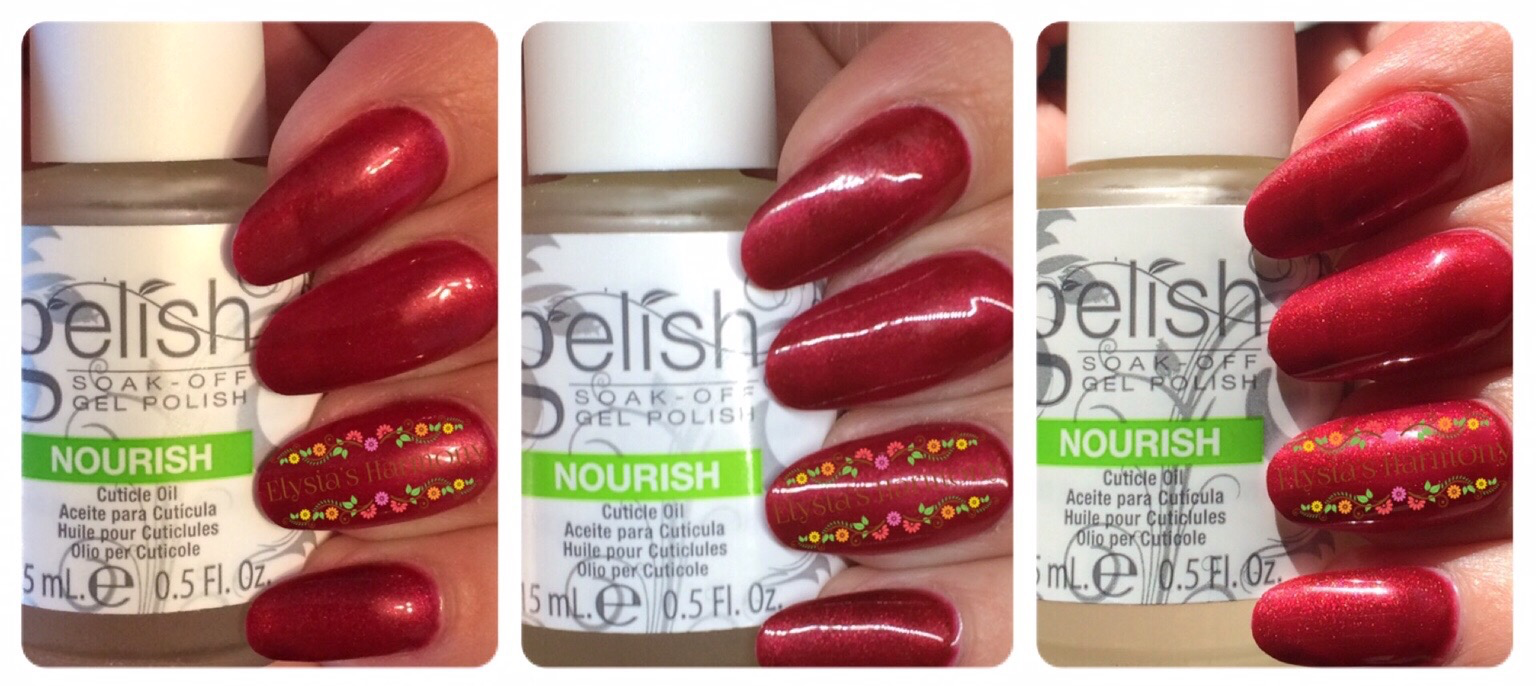
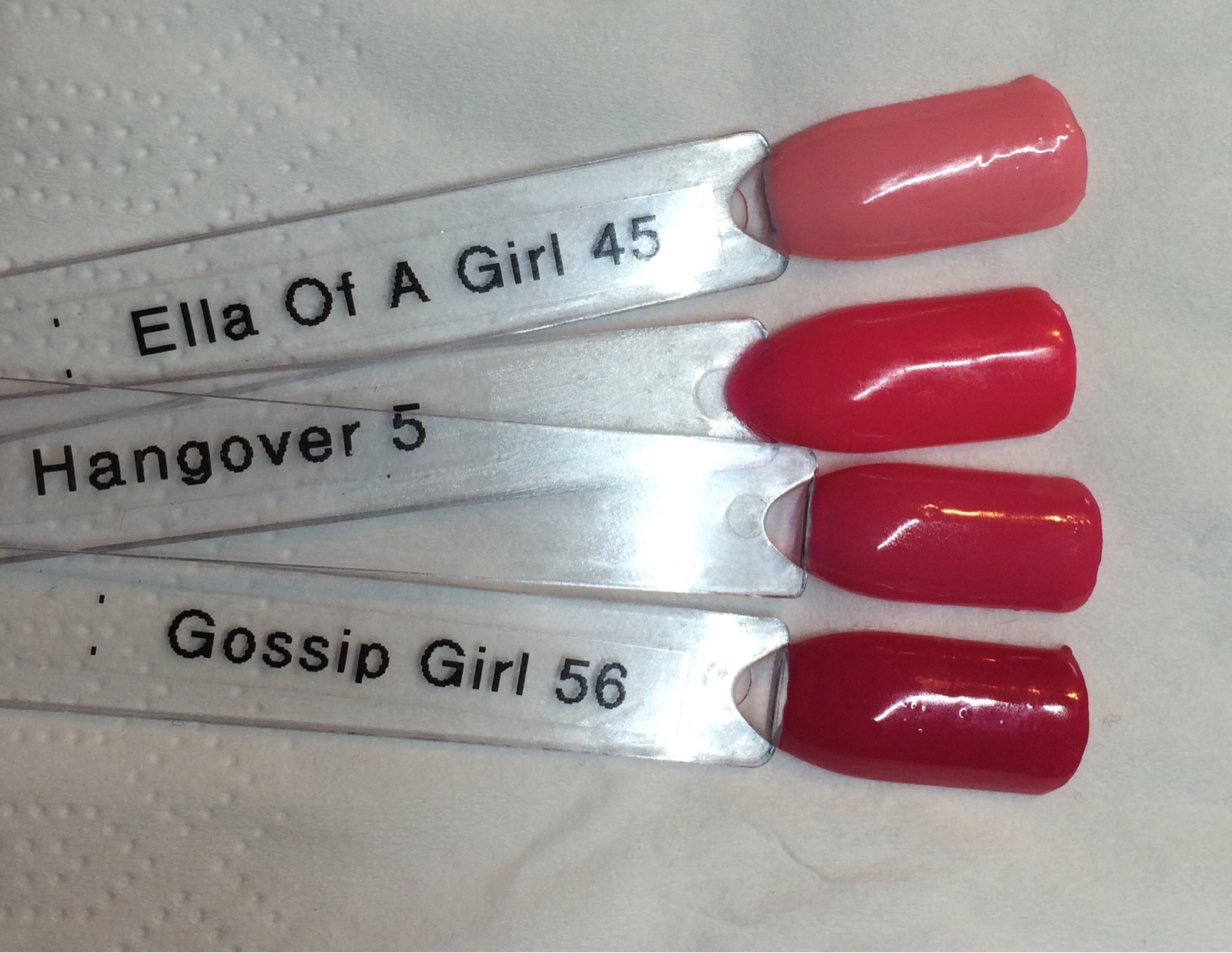
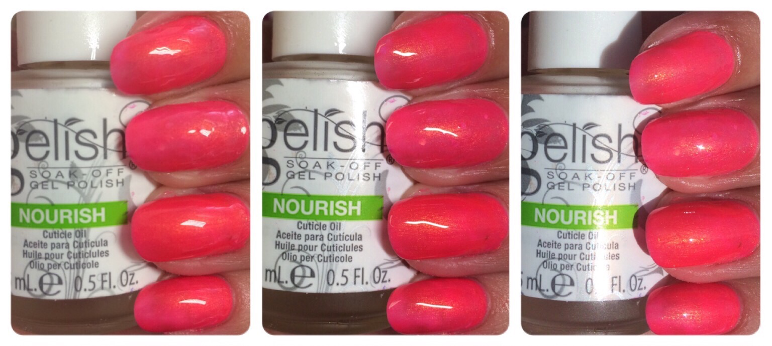
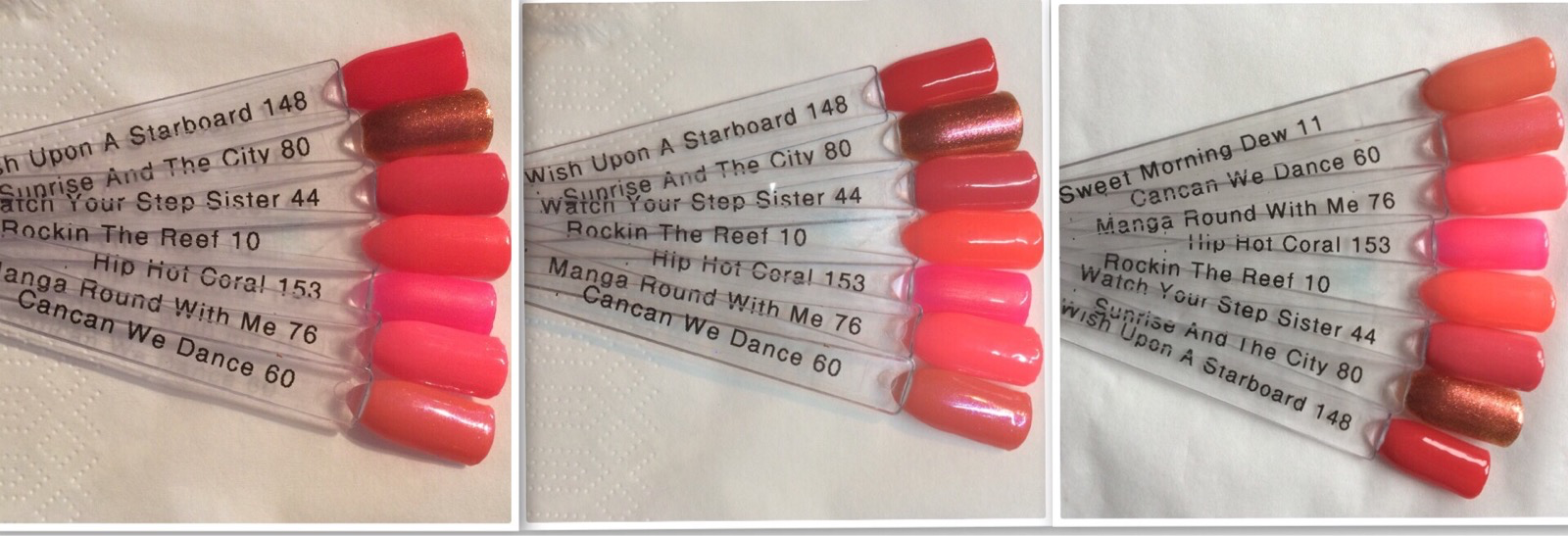
Hip Hot Coral – 2/3 coats

This bright coral red is beautiful with a stunning orange gold pearl finish and is unlike any other Gelish colour I have. I think it again could possibly benefit from a white underneath but is a personal choice. A new colour to my collection and I can see it be very popular.

Hip Hot Coral lighting comparison pictures

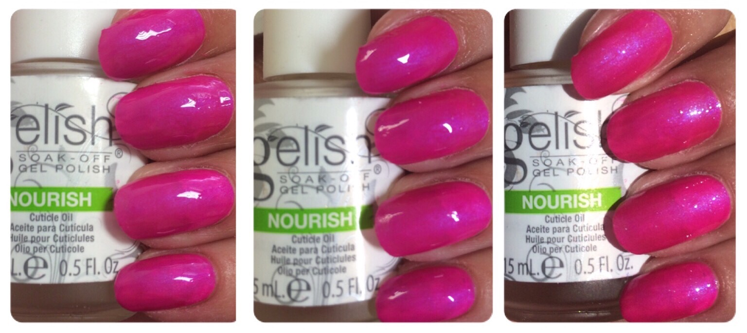
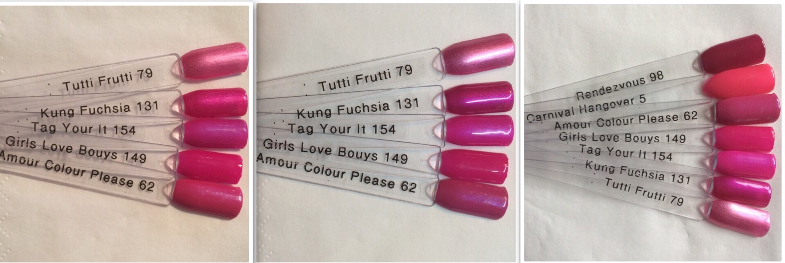
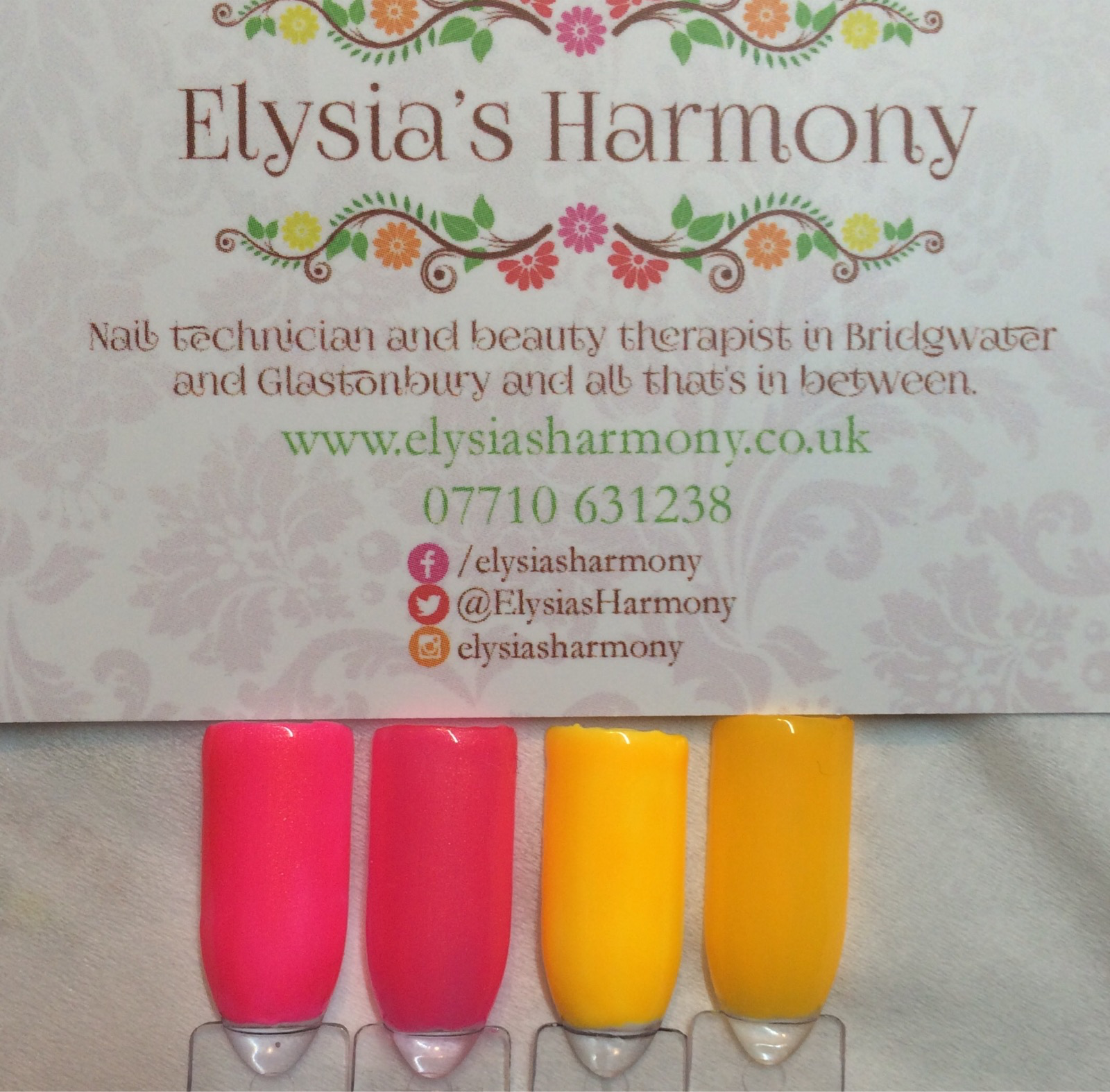
Tag your it – 2 coats

This bright fascia pearl has fantastic coverage and great application in 2 coats. It is quite similar to kung fu fuchsia but a little lighter and I can see it being very popular.

Tag Your It lighting comparison pictures

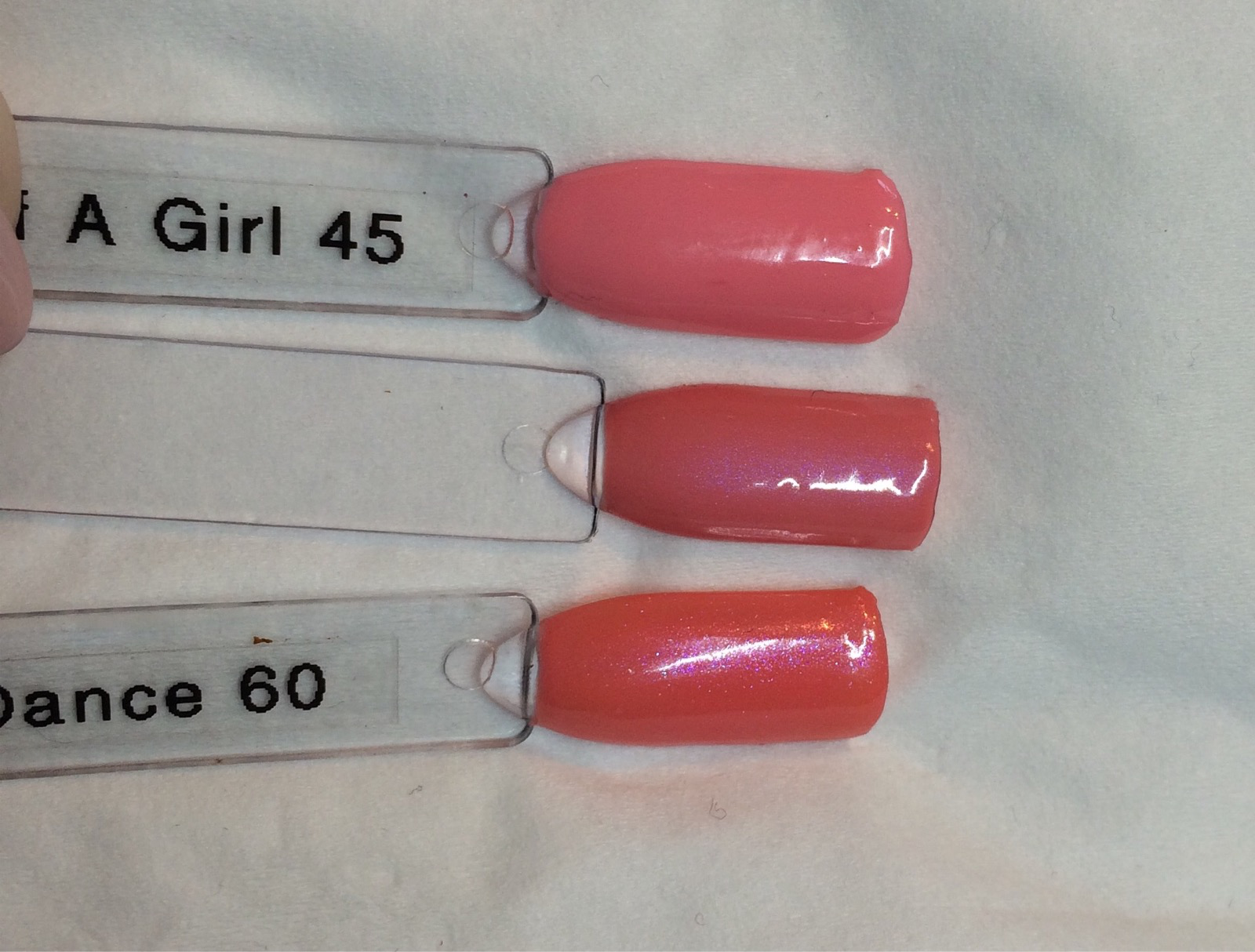
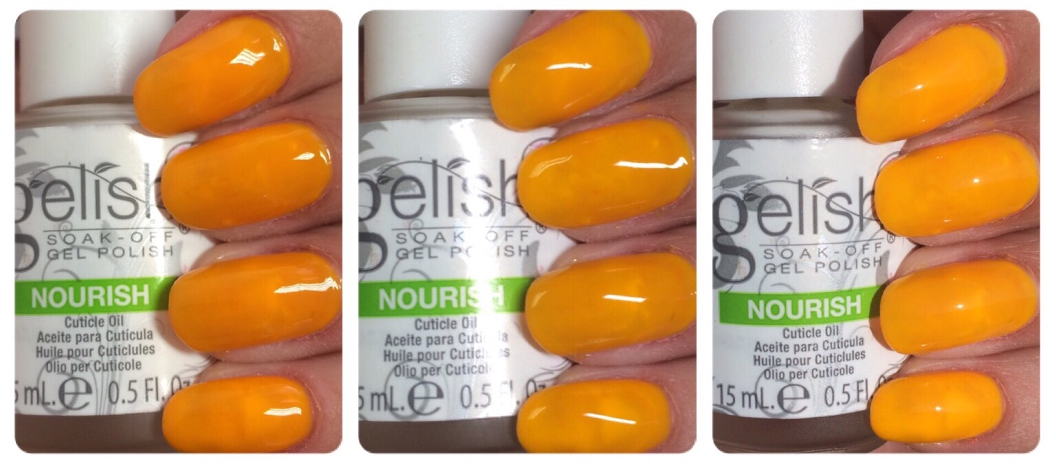
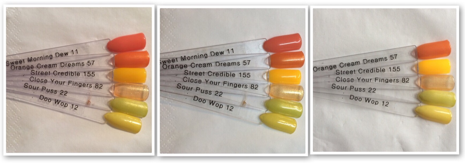
Street Cred-ible – 3/4+ coats

This is an orange yellow which is really very beautiful, however the application and consistency are a little thin for my liking. You can see from the swatch comparisons below the difference putting white beneath it makes, so I think I would probably do 2 arctic freeze and 2 colour coats. This picture actually has 5 coats. On practice with the application of this colour I have come up with two options.

  1. Apply a thin coat (not curing, then another thin coat and cure, do this three times and you get a beautiful coverage.
  2. Apply two coats of arctic freeze and the. Either 1 or 2 coats of colour to give a beautiful coverage.
Street Cred-ible lighting comparison pictures

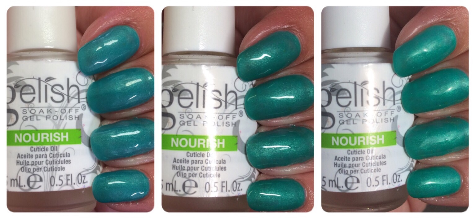
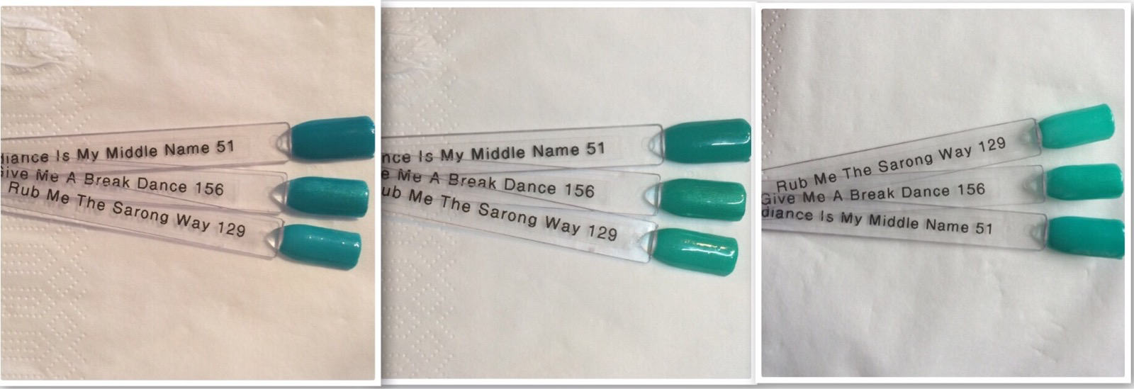
Give Me A Break-dance – 2/3 coats

This teal pearl is very beautiful and I do not think the pictures do it justice. The application was OK in 2 coats however I think I will stick with 3 for clients. Its got a nice shimmer in it however is very similar to rub me the sarong way, so if you already own that I think unless you really desire this its not really a must have.

Give me a break-dance lighting comparison pictures

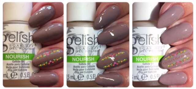
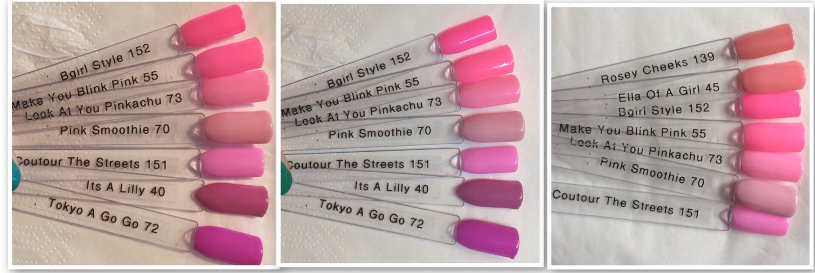
Swatches and Comparisons 

Street Beat Swatches Indoor Light
Street Beat Swatches LED Light
Street Beat Swatches Day Light


Cou-tour the streets swatch comparisons
B-girl style swatch comparisons
Hip Hot Coral swatch comparisons
Tag Your It swatch comparisons
Street Cred-ible swatch comparisons
Give me a break-dance swatch comparisons
Street Cred-ible & Hip Hot Coral with arctic freeze underneath

Summary

I was really looking forward to this collection and the colours do not disappoint. The application isn’t quite what I have expected of recent collections but is still reasonable once you’ve figured out what works best for you. Business wise my top 3 would be: B-girl style, Hip hot coral and Tag your it, as these three would be in my view the most popular with clients and have a reasonable coverage. For me personally I would buy: Street cred-ible, Tag your it and Give me a break-dance as they are colours I would wear.

I hope you find this helpful and would love to hear any comments or feedback you have 🙂


Botanical Awakenings Collection

Hi all

Here are my swatches for the new spring Botanical Awakenings Gelish collection launched in the UK as singles straight away on the 25th March 2016.

At first glance this collection doesn’t really have any must have stand out new colours, however on closer look I consider this collection a good buy, in that they are staples that your clients will want to go back to time and time again. The collection is based on fresh floral colours which includes 2 neutrals, 3 pinks and a red. After last springs discontinued ooh la la collection (which I loved) I’m glad to see some slightly similar shades. There are Morgan Taylor nail lacquer matches available.

So let’s take a look at the colours (the pictures show the colours over hard gel extensions following my fabulous PhD training – totally worth doing).

Rose-y Cheeks – 2 coats (needs warming)

When I looked at this colour on the advertising I felt it looked a lot like Ella of a girl, however on application I’m pleased to say it’s more similar to can-can we dance with its light coral pink with a pearl finish. I love this colour in the led lighting with its subtle shimmer and I can see my clients loving this one to.

Rosey Cheeks, Botanical Awakenings
Rose-y Cheeks

Warm Up the Car-nation – 2 coats

Nail Harmony state this is a hot magenta pearl and yes it has a pearlised shimmer frosty touch to it, but to me it’s more of a medium pink going towards red. Think sugar plum dreams but without the transparent finish. It applied nicely and didn’t need warming.

Warm Up the Carnation

What’s Your Poinsettia? – 2 coats

As expected this medium frosty pearl is a great two coater just like queen of hearts and I’m so hot, but it is very similar in colour, finish and application, so doesn’t really offer anything new. But is admittedly slightly lighter. That being said its been chosen by 2 clients already so is going to get well used.

Whats Your Poinsettia

Don’t Pansy Around – 2 coats

This was my favourite colour of the collection, it’s a bright (but not neon) medium crème pink. It applied nicely without any warming and is just a lovely every day colour. Please not this is an easy one to apply too thickly so keep the coats thin.

Dont Pansey Around

Prim-rose and Proper – 3 coats

This colour is a light taupe cream with a hint of pink (less so then tan my hide). Yes it is indeed similar to other neutrals in past collections so you could do without. That being said it is different from tan my hide as you can see from the additional picture and I can see it being chosen quite a lot over the wedding season. So if you plan on doing brides and weddings I believe be it would be worth the investment.

Primrose & Proper

Primrose and Proper vs Tan My Hide

I Or-chid You Not – 3 coats

Another taupe creme which is very similar to rodeo however is more mushroom and slightly lighter and in the additional photo you can just about see the difference when applied. I actually much prefer this colour and I am looking forward to wearing it on my hands for longer then 5 minutes.

I Orchid You Not

I Orchid You Not VS Rodeo

Swatch sticks  and comparisons

I apologise for the state of my swatches I knocked acetone over on my desk when I had my light nude swatches out and it ruined quite a few and I wanted to get this out so haven’t re done them yet.

BW Full Collection swatches

Reds Comp

Pink Comp

The bottom unlabelled swatch is sugar plum dreams.

Pink Comp 2

Pink Comp 3

Primrose Comp

Rodeo Comp

Conclusion

This is a collection full of useful every day colours that your clients will go back to time after time. My top 3 are Rose-y Cheeks, Don’t Pansy Around and Primrose and Proper.