
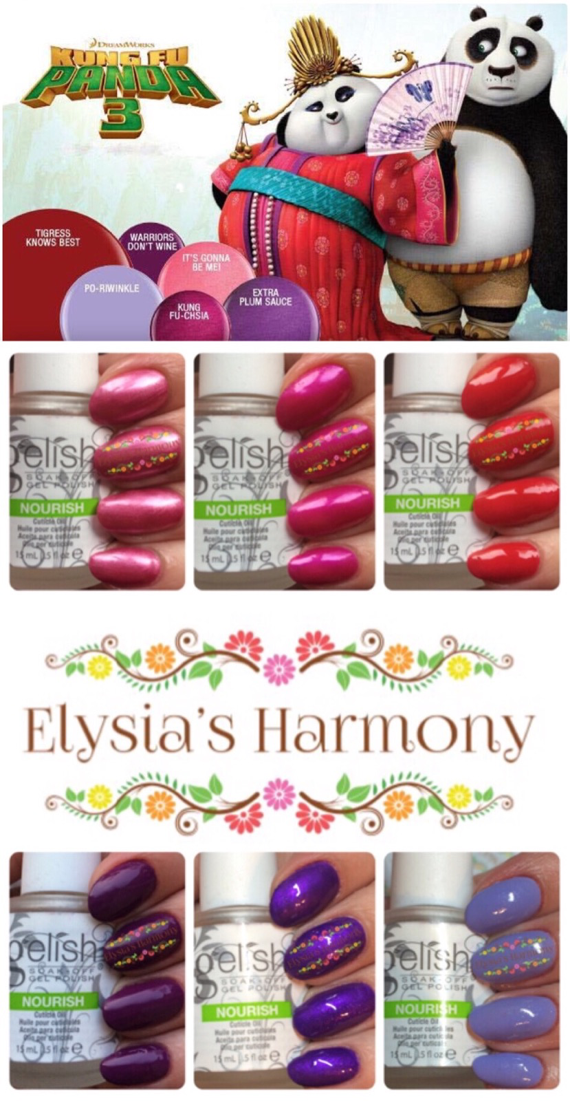
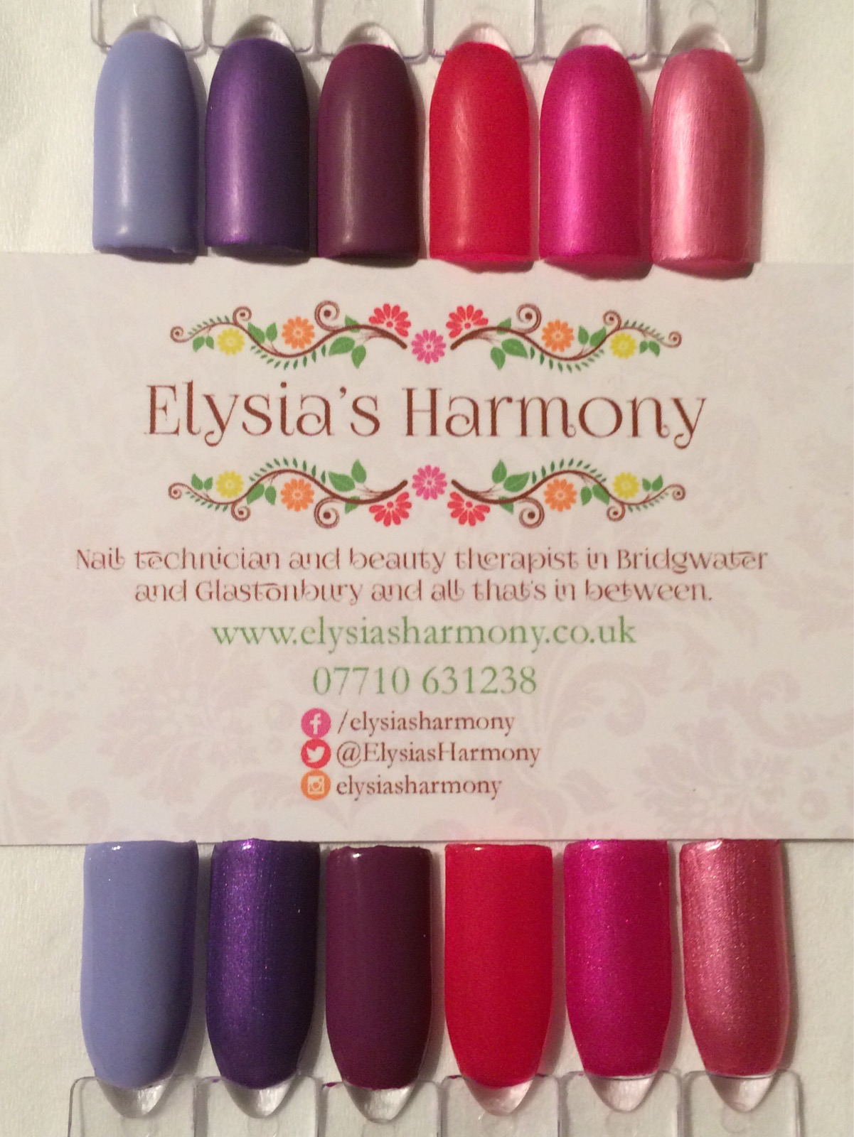
Hi everyone, here are my swatches for the Kung Fu Panda 3 collection launched by Nail Harmony UK on 28th February 2016. This collection is made up of 6 beautiful shades based on the Kung Fu Panda 3 film and most of which are ideal for spring. There has been a lot of buzz about this collection and the educators at Nail Harmony UK have been trialling them for the last few months since their release in the US in December 2015. There has also been a lot of buzz over the potential of a new lilac and I am putting it through its paces in a “colour in the spotlight” review. As per my usual way you will see the colours in different lights so you can get a truer reflection of the colour and there is no editing effects or smoothing, just my nails painted with the legitimate colours (different lighting is indoors, LED and outdoors). If you have any questions, want to see more comparisons or have any further thoughts and opinions on the colours please comment and share below.
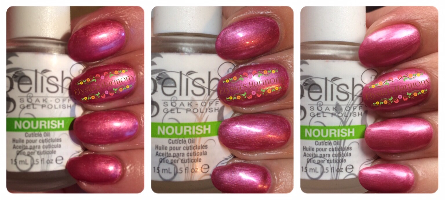
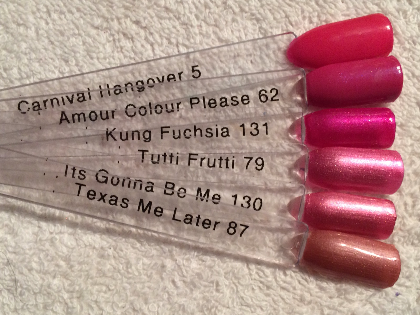
It’s Gonna Be Mei – 2 coats of rose pearl
This colour is a beautiful pearly light pink. It applies nicely in 2 coats and I can see it being popular with my older clients. It is a bit lighter and rosier then tutti-frutti but different from texas me later.
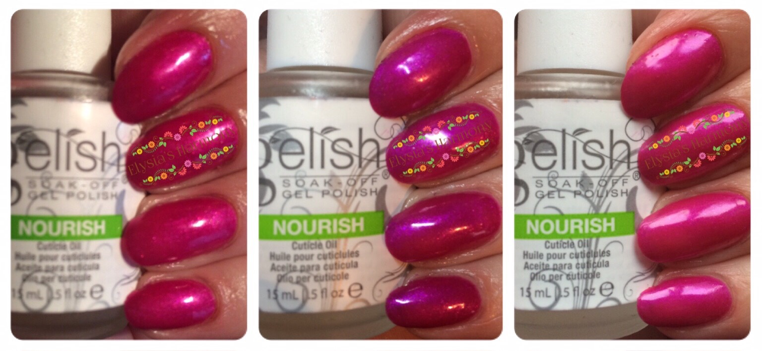
Kung Fu-chsia – 2 coats bright fuchsia peal
This for me is the highlight of the collection, I absolutely love its bright shimmery lushness of this colour, it applies beautifully and has proved the most popular with my clients so far. A nice new addition to the Gelish line especially as Amour colour please was a limited addition last Spring.
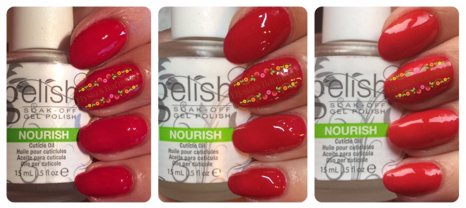
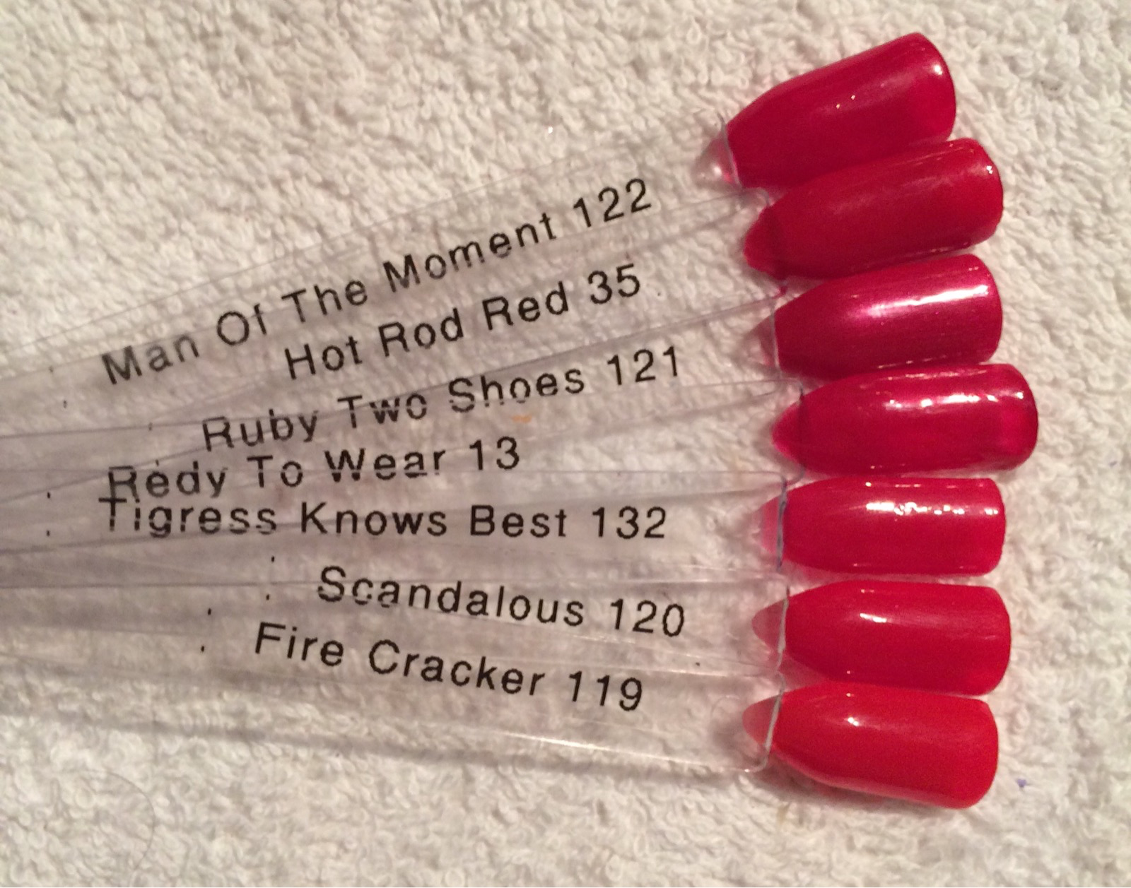
Tigress Knows Best – 2 coats hot red crème
This bright red applied beautifully in 2 coats and is a beautiful red and will be my new go to red when clients cant decide. That being said if you have hot rod red or scandalous you probably don’t really need this one, however it is easier in my opinion to apply then scandalous and fewer coats then hot rod red.
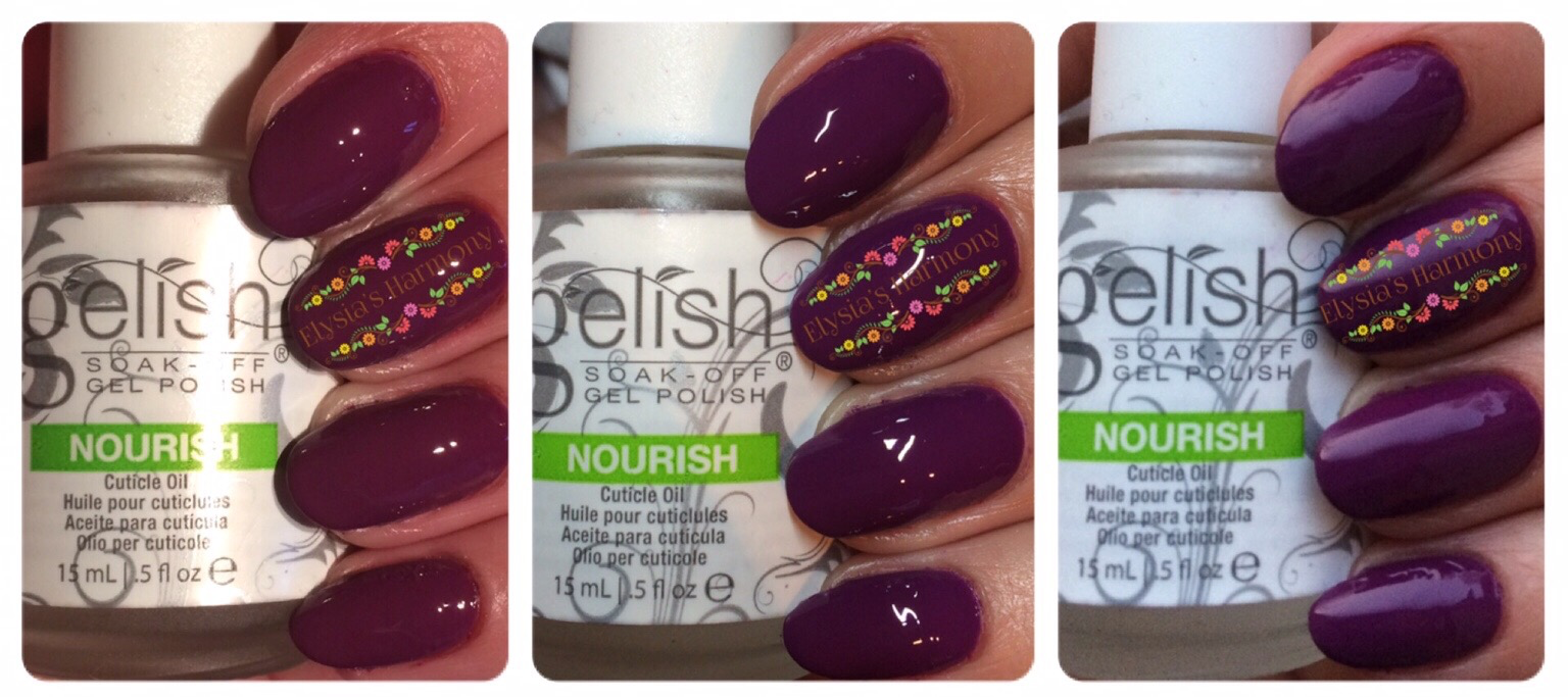
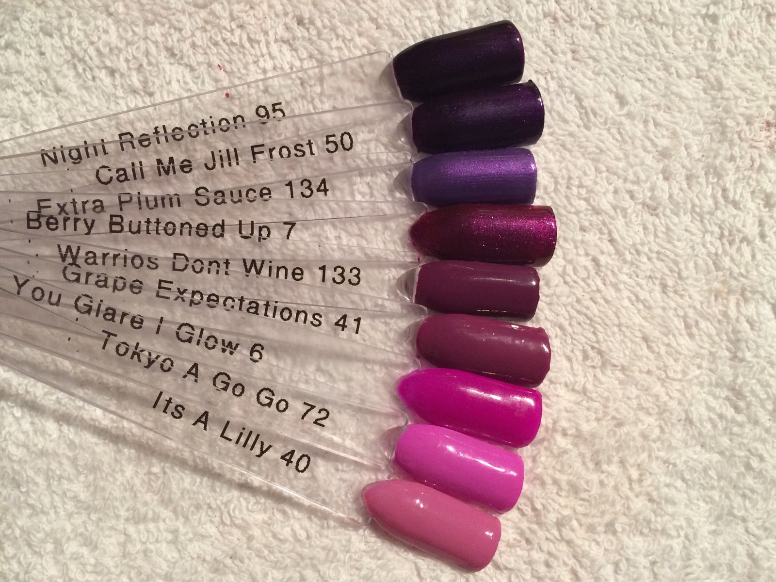
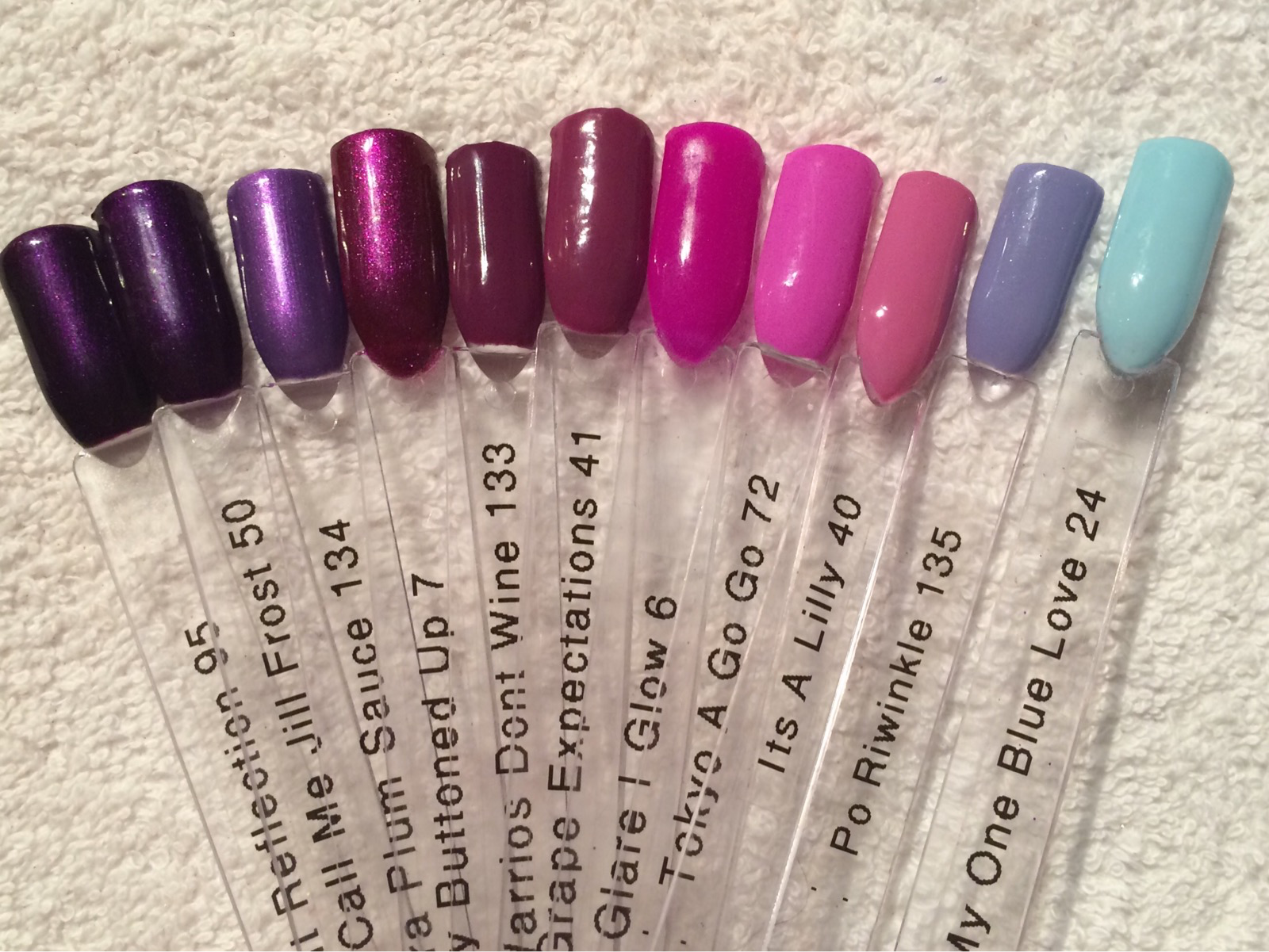
Warriors Don’t Wine – 2 coats crème plum
I love this colour it’s a really beautiful mid plum crème. I can see it being very popular with clients especially with those who like grape expectations which is a little lighter.
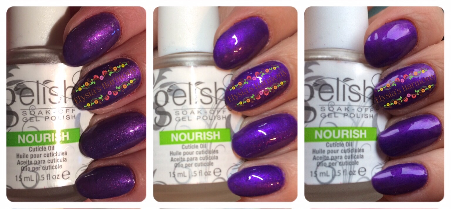
Extra Plum Sauce – 2 coats of amethyst pearl
This colour is beautiful and will be exceptionally popular with my clients. It is a beautiful bright mid to dark purple with a shimmer pearl finish. Think Call Me Jill Frost only lighter and brighter. As far as I can tell it is completely new colour in the Gelish range. I would recommend you give this one a stir before you use it, as it did come out a little watery when I first swatched it.
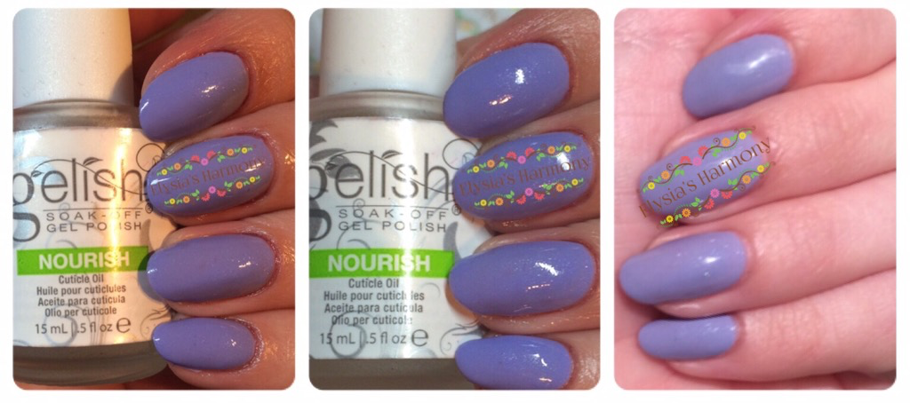
Po-Riwinkle – 2/3 coats of light periwinkle crème
As the name suggests this a is periwinkle blue with a subtle shimmer. There had been hopes for a lilac and although this is a beautiful colour with purple hints to it, it’s not lilac. Fingers crossed for next year. It was the only colour of the collection which required me to use 3 coats. However that being said some nails where fine after 2, so I imagine with more application practice I will get used to the amount needed and could probably do it in 2 slightly thicker coats. I can see it being very popular with younger clients and have seen some spectacular designs with it already and it is completely different to all other colours in the Gelish range.
Since initially writing this I am pleased to say I have tested it for 2 weeks, whilst on holiday in Tenerife, going swimming in both the sea and the pools almost every day and a heck of a lot of sunscreen and after sun lotions (my daughter is allergic to the sun,) and I am pleased to report that there was absolutely NO FADING (more details in the next review). (Unfortunately the sun had gone in by the time I had painted this colour so the outside picture is on holiday a few days later.)
Swatch Sticks & Colour Comparisons
I am pleased to say that on every single swatch I only used 3 coats, so you know it’s good stuff when applying over clear sticks. The top row is what the colours look like matte and the bottom with the regular top it off.
Conclusion
This collection has many new shades to offer and once again Gelish seem to have been perfecting their formulas to get them to the desired two coats. I didn’t experience any application issues with wrinkling or shrinkage with these and they seemed to be fairly flexible on the thickness of the application so should work for most and if you are having any application issues with any colours try warming the colour a little first. I am really pleased with the shades in this collection, if I had to pick just 3 they would be Kung Fu-chsia, Extra Plum Sauce and Po-Riwinkle with Warriors don’t wine close behind. Singles will be available mid March and Morgan Taylor Lacquers offering the matching colours, so a fantastic chance for retail to your clients – they will want them.
I would love to hear your thoughts or see any of your designs using these colours.
Stay tuned for the Po-Riwinkle colour in the spotlight review 🙂